Pop quiz! You are going to have to open the HUD menu on your own this week! Not so bad, is it? But you can do it, I believe in this class! I would have shown you again, but that feels redundant. Plus… I feel like mine got EVEN WORSE somehow! Having a Carbuncle out really makes a big mess, huh?
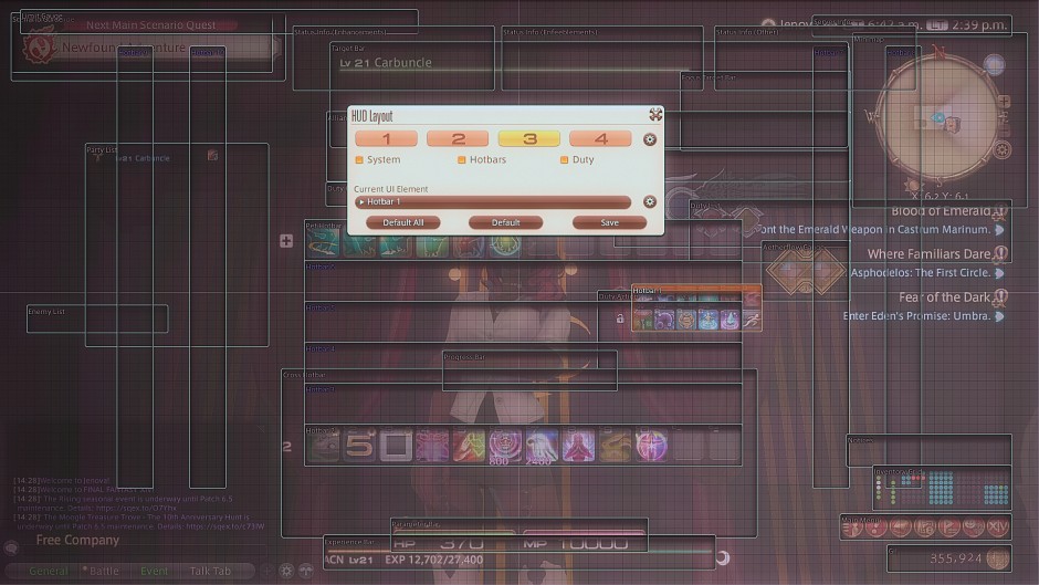
Last week, we went over the basics of how to manipulate the HUD! Today we are going to take a look at some other functions, as well as a couple of arrangements! Let’s jump right in! First, the Status Info Boxes!
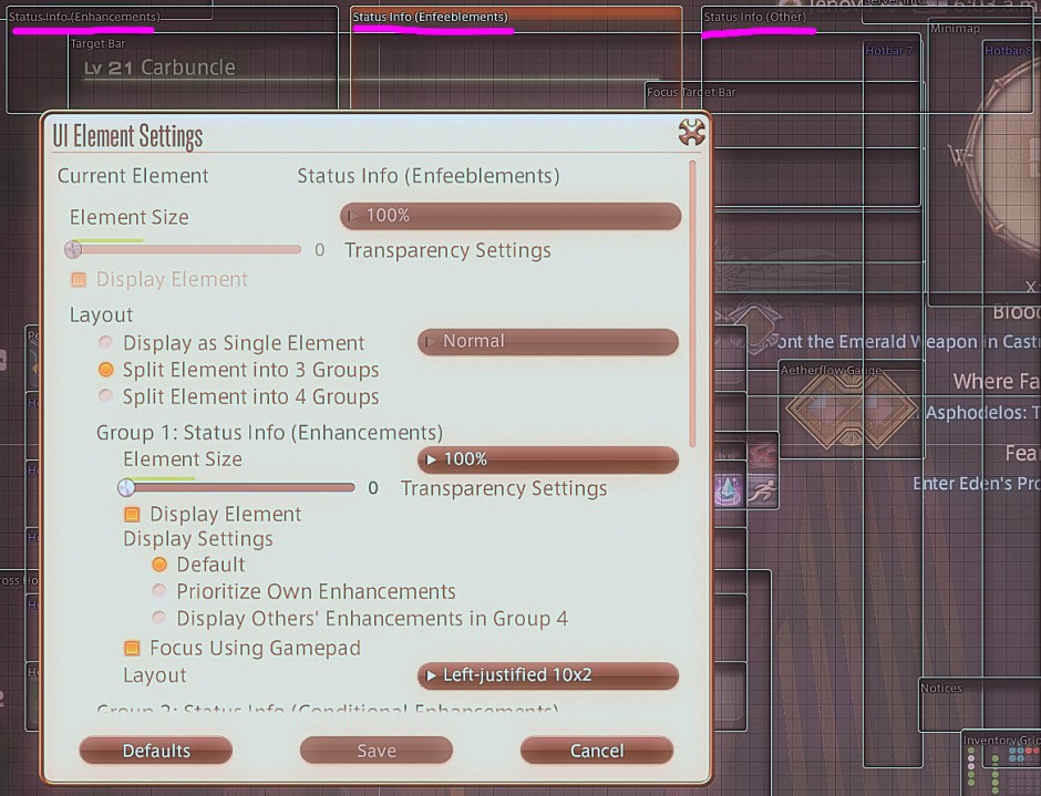
Located at the top of the screen, you will see by default there are three. This gives you a lot of freedom for how you can place them about! Do you want debuffs under your name? Bonuses by the minimap? Or maybe you would like to combine them all into a singular box?
The world is your oyster, and the choice for this is yours!

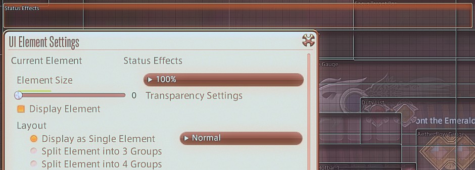
Perhaps you do not want them to show at all? Another option for those who prefer minimalism to readily available alerts! I know you are out there, do not feel ashamed! To hide the window, you could open the menu and make it entirely transparent, but for a quick way to remove things, simply right-click!
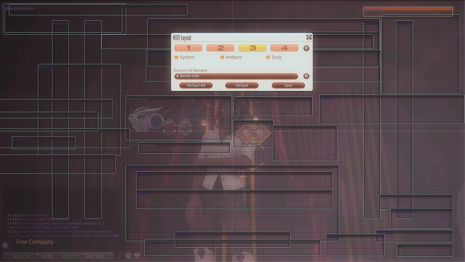
In fact, with the exception of a few duty and class items, you can hide almost everything! Turn off the map and wander! Turn off the time and forget all responsibilities and come to class unprepared and bemoan that I gave you an F! I simply provide the tools of knowledge! What you do with them is entirely up to you.
Regarding the HUD itself, there is not really much more to go over, so let’s consider some design options!
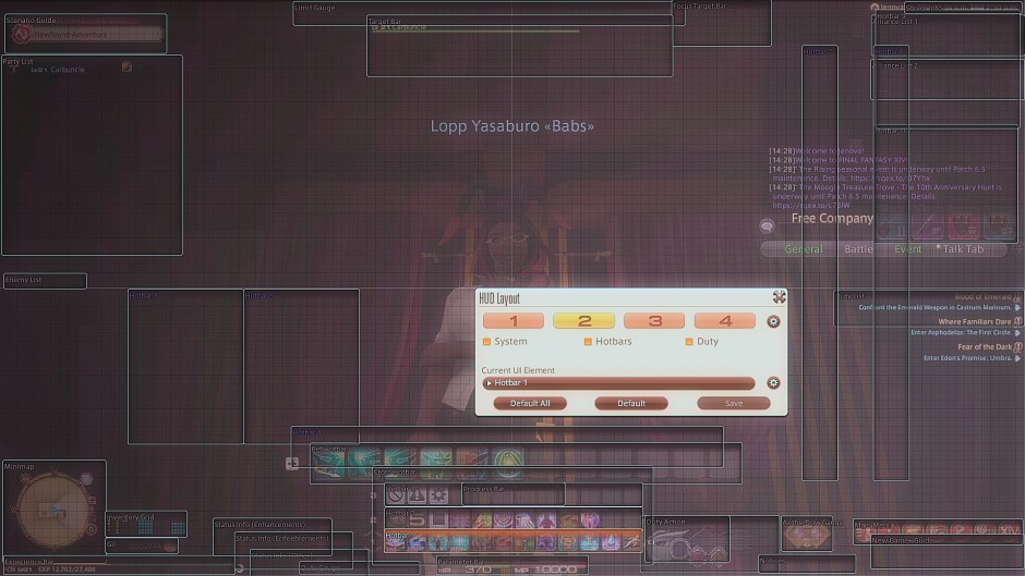
This is the layout I like to use! It keeps everything tiny and to the sides, giving me a clear view of my surroundings! While it may appear that I have a lot going on, this is only my keyboard control view. I actually prefer to play with a controller, maybe because I’m lazy, or maybe because it’s more comfortable for me! Feel free to judge on your own time, though. You are in class and it will have to wait!
As an added bonus, did you know you can hide the HUD entirely with Print Screen? It’s true, and perfect for snagging a photo when you’re unable to or don’t want to open Gpose!
For you fellow controller junkies with no keyboard, you can achieve the same thing by pressing the top left shoulder button in conjunction with whatever the select button is for you! Pretty nifty, right? You have a virtual mouse as well! But maybe that should be in another lesson…
Stick to the plan, Ms. Y!
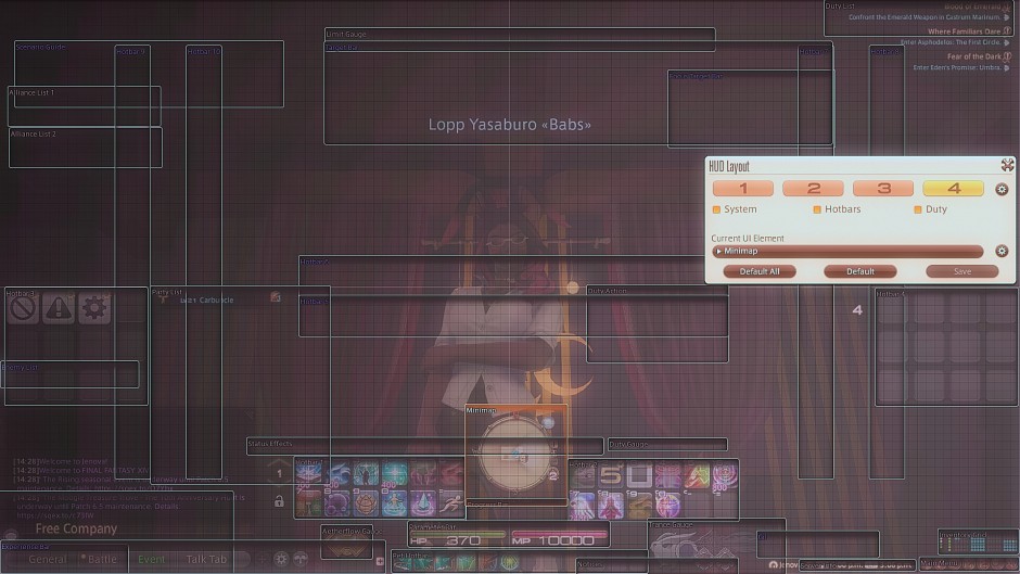
A raider may find more utility with more hotbars active in a focused spread that keeps the flow towards the center of their view where the enemies are. This might help them to keep a keen eye on both the battle and their teammates without eyes darting around like mad looking for the next skill in their set!
looking for the next skill in their set!Though, if one were to take our course on Macros, they might find so many hotbars unnecessary, just saying…
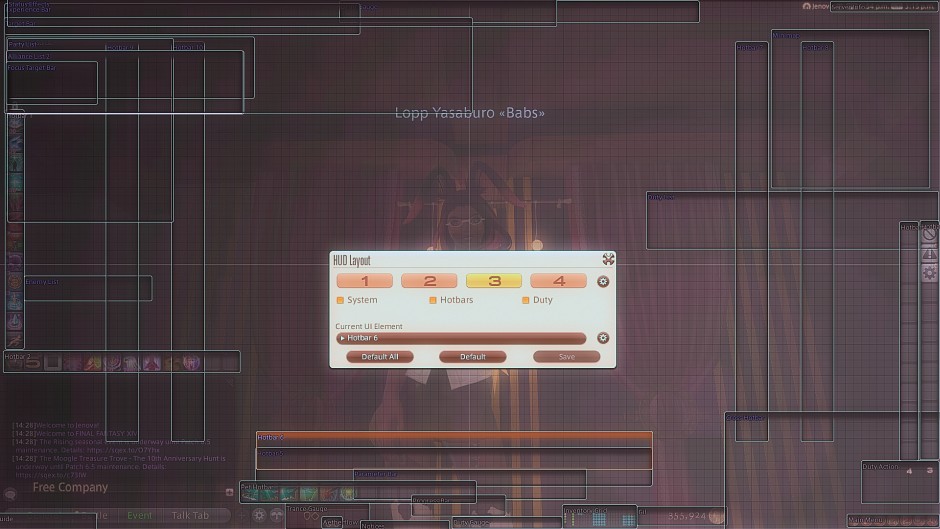
For a Role Player, though, perhaps an even cleaner UI is important. Gil, inventory, all important, while targeting information could take away from the immersion more. We all know what we have in our purses, right?
Would it not be wonderful to pull them out with ease? And on the other hand, do you need a map for interacting with others, or is it just taking up precious screen space that could go to hotbars filled with emotes perfect for any occasion? It is entirely up to you!
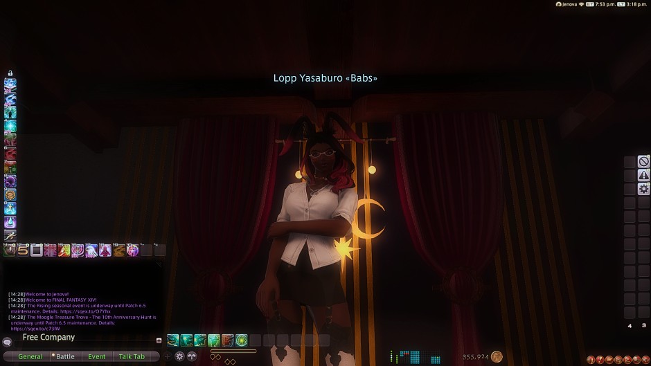
Someone turn the lights back on, please!
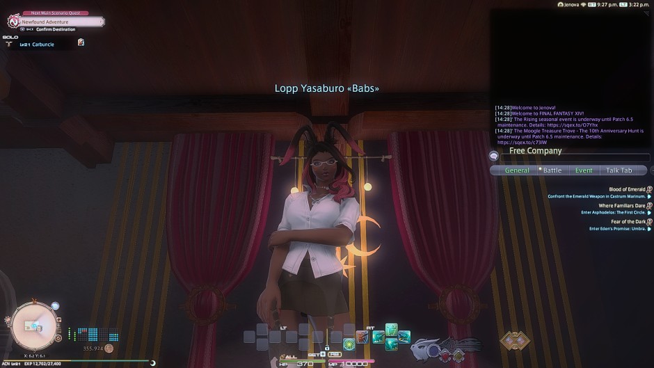
Thank you!
For the last portions of the lesson, I will be using my own setup! It is a bit unconventional, perhaps, but I like things how I like them!
First, you may have noticed my Chat window is up in the top right corner! How did I manage this? It’s not something in the HUD menu. It might not be intuitive, but this is done without the HUD menu up at all. It CANNOT be moved when you are adjusting the HUD, actually, and sadly!
To move it around, click and hold the General tab and drag it around. This lets you place it pretty much wherever you would like! You can actually separate the other tabs as well if you want more chat windows at once! Just click and drag them away!

As for what is displayed in Chat, that is a lesson for another time, something we are running out of today! So one final thing to go over in our UI series before I let you go! Remember, I say when class ends, not the bell.
I will be opening up Character Configuration for this, but you are welcome to open any window of your choosing.
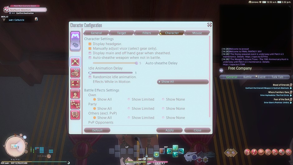
That sure takes up a lot of space, does it not? And when you’re doing something, maybe a giant window blocking everything is not ideal! This is something we can adjust as well - though, again, it is outside the typical HUD menus.
At the top of the window, simply right-click! This will bring up a “Scale Window” option that allows you to resize these types of windows quickly.

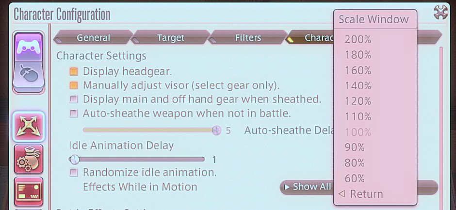

Much more manageable, huh? Alright, class, that is all we have for today’s lesson! Be sure to study up! Next time, we will be getting even deeper into these Character configuration settings, so I want to see some clean HUDs walking in! Take care!
